

Do you know how to make your room look bigger, taller and lighter using only paint? Or how to use colour to make a space flow more effectively? As an architect and interior designer, I’m fascinated by these questions and how to use colour successfully in buildings. I went to a talk by Farrow & Ball’s colour guru Joa Studholme to find out more secrets of the trade.
Joa is the woman behind Farrow and Ball’s hugely popular paint colours, which she has christened with evocative and memorable names such as ‘Dead Salmon’, ‘Elephant’s Breath’ and ‘Salon Drab’ to list but a few. She knows everything there is to know about pairing paint colours.
Joa’s starting point was base neutrals – stating that choosing your base colour is the key to a successful paint job. As well as imparting very practical advice about which colours were yellow-based neutrals or traditional-based neutrals and which colours looked good together, she encouraged us designers to break the rules. She advised experimenting and being bold with colour. As with all good design, confidence is key.
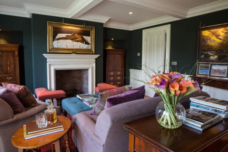
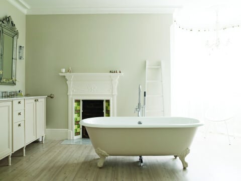
She noted that small rooms can be really dark and still work. Porches painted in deep dark colours can make the adjacent entrance hall look much bigger. Woodwork and cornicing can look striking in bold colours. It’s all about the harmony between colours, the contrast and the juxtaposition of colours in adjacent spaces and the groupings of colours. Used well, paint can create better flow – something us architects think about a lot, in homes and in commercial buildings. And she emphasized that when everything works you don’t notice it, it’s when it doesn’t work that you start to wince and think ooh that isn’t working too well.
So the key words here are ‘used well’ and that’s the challenge. I used to paint artworks, but found that I’m too impatient to be a good painter, however, the skills I learned in the artist’s studio transfer to creating colour schemes or flow in any space. I’m always learning and experimenting with colour schemes – in fact it’s a bit of an addiction – so this lecture fired the colour scheme of my imagination.
The key points of Joa’s advice are as follows:
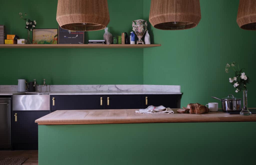
- Successful colour schemes are about choosing your neutrals and deciding on your base colour. Is it a red, yellow or green based neutral? This is key to knowing what other colours will harmonise with it.
- Choice of base colour is personal.
-Do you want a warm feel? If so, go for red or yellow based neutrals.
-Do you want a fresh feel? Go for blue-based neutrals.
-Do you want the scheme to be based on a favourite artefact or painting in a room? If so, look closely at the base tones in that object and match them. - Successful colour schemes are about using contrasting colours from the opposite sides on the colour wheel, so getting familiar with the colour wheel is crucial.
- Understand the effect that a light or dark colour will have on the space and the adjacent space. Using a dark colour in a small space may make it look bigger. If you want to go dark and are not bold enough to paint the whole wall, using a dark colour below eye level will work, too.
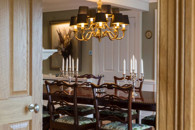
- Study the light in the room. Is it north light or south light? Is it light in the evening or the morning? If there’s a lot of daylight in the room, celebrate it and go light but think of using a darker colour on the woodwork. If it’s a dark space, go dark and think about painting the woodwork dark too so that the woodwork doesn’t cut the space up but blends the surfaces together creating the feeling of height.
- Success is about using all the surfaces in the room to create effect. Think of the ceiling as your fifth wall and the floor as your sixth wall. A ceiling in a lighter tone of your wall colour will soften the junction between the walls and the ceiling, creating a taller room. Simply painting it white could kill the wall colour below.
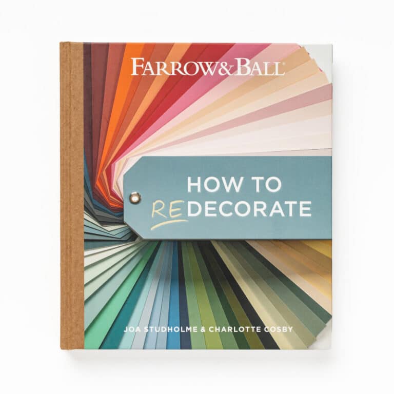
- Read Joa’s book for Farrow & Ball, called ‘How to Decorate’ for more useful colour advice.

Thank you Joa for your lunchtime talk and to my artistic companions, a photographer and client, a past client and an artist for accompanying me. We all know a little bit more about how to make our rooms flow better, look bigger, taller and lighter by using paint.
If you would like ideas on creating flowing spaces using colour in any building we are happy to talk to you. Call 01360 661144, or email mail@thomasrobinsonarchitects.co.uk
Click here for more detail on this project using Farrow and Ball’s Blazer